By navigating to the Bi/Analytics section in your web app you will have access to our brand new menu about custom reports. Select the Report Designer option and you will be navigated to the screen where you can now create your own reports.
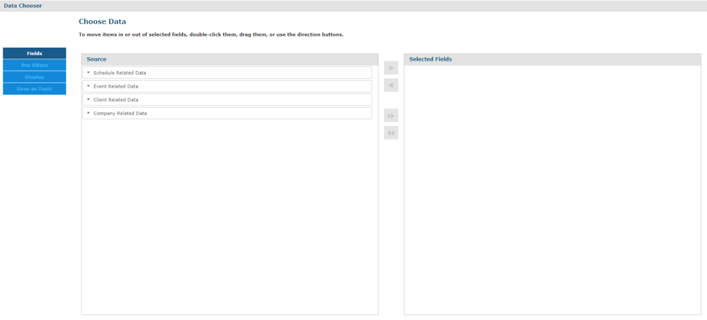
On the “Select Data” screen, choose the Domain (unique for your Company) and you will be navigated to the “Choose Data” screen:
In this screen you will be asked to select one of the pre-defined data groups each corresponding to a group of fields available:
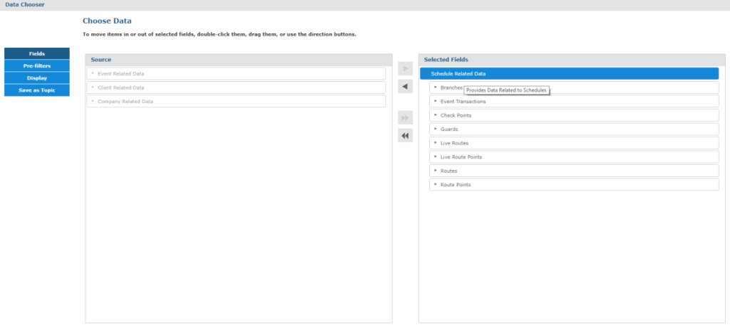
On your left there are all the tables that are available for you. You can use them in tables, crosstabs or even charts! Use them as filters to customize your report even more.
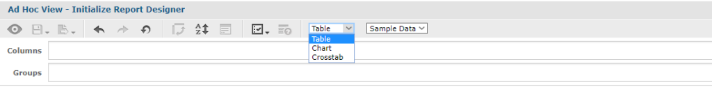
First select the type of report you want to create by selecting one of the 3 available options (Table, Crosstab and Chart).
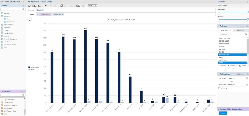
Select the Chart option to create more visual-appealing data like pie charts etc.
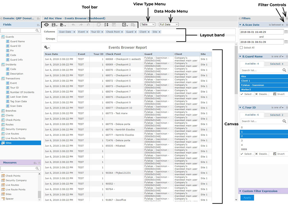
Νavigate to the left of the screen and select the fields you want to use in your report. With a simple drag and drop you will be able to visualize your data.
You can select to use the tables as fields or measures and visualize them in columns or rows to experience a fully customized report.