- Go to Reports -> Create Report
- On the type of table select the Chart option
- Select the fields or measures you want to display and drag and drop them to the columns or rows of your chart.
- Click on the
 icon to select one of the many available chart types to display your data.
 - Select the depth of aggregation for your rows and columns.
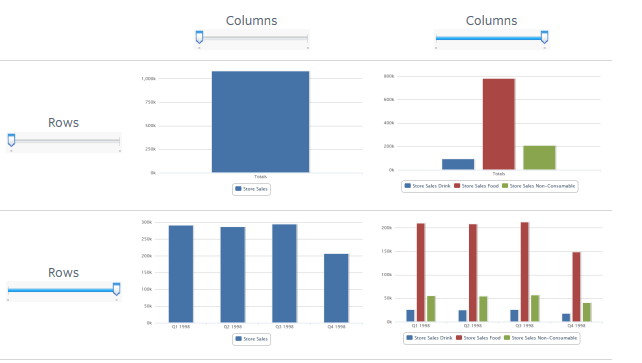
- Use the sliders to see how you chart changes.
- They reflect the hierarchy of the groups (rows or columns) as they are defined by the order that the fields are arranged in the Layout Band.
- If you hover over a setting on the slider you will see the name of the field or dimension corresponding to that value.
- Pivoting a chart causes the slider settings to be preserved and applied to the new target.
- Removing the currently selected level from a row or a column resets the slider to the total when you remove a field that is not selected then the level remains the same.
- Adding a field or a dimension to a row or column causes the number of levels of the slider to change reflecting your addition.
- Changing the order of the fields in a row or column causes the level of the slider to change to reflect the new level of the field to correspond to the selection.
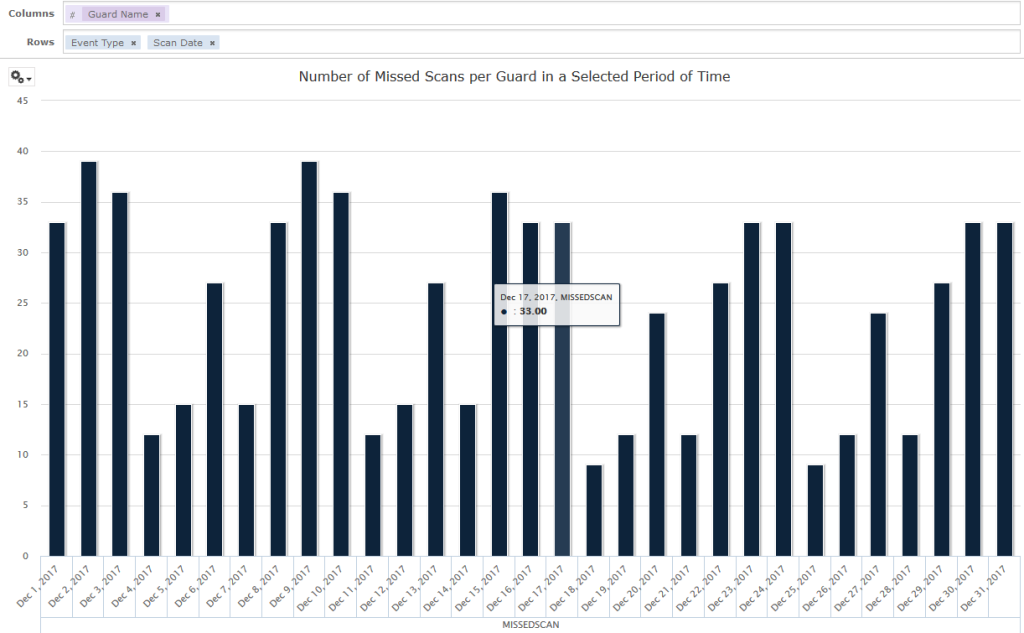
Changing Date Grouping
If the created chart includes data based on a date field, the user could change the level of aggregation for the time data. To select the unit of time to chart can simply right click on the date field in the Layout Band and select the Change Grouping option. He/she can then select the time period that wants from the cascading submenu. The chart will update reflecting the new date grouping. (Time Series Chart can use only day or smaller intervals)
Changing the Summary Function of a Measure
The user is able to get a new view of his data by changing the summary function of a measure (from the sum to average or from count to count distinct). To select a new summary function for a measure:
Go to the measure you want to select and right click on it. Select the Change Summary Function and then the select the function you want from the context menu. The chart will be updated to display the new summary function.
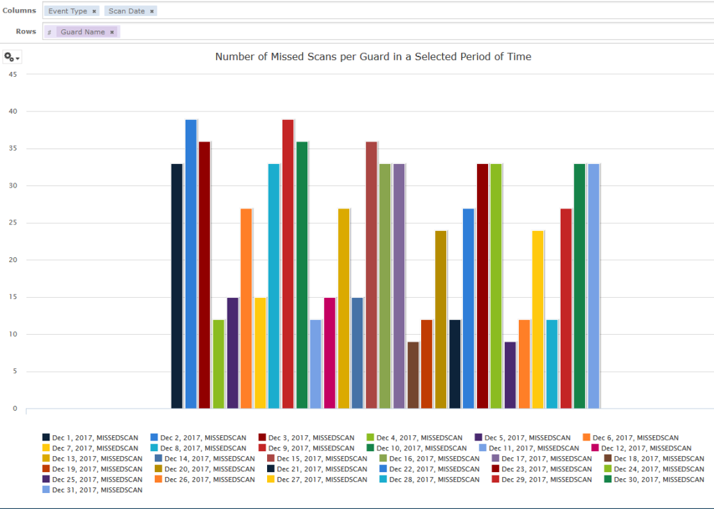
Pivoting a Chart
You can use the Chart Designer to pivot your chart in two ways:
1. You can pivot the entire chart by clicking on the  . The row and the column groups will switch places but the slider levels will be maintained. For example, the following chart: